


Hey, I know. I’ve been in your shoes, and I can relate to how frustrating it can be to find that perfect balance between looks and function. Also, designing becomes even more challenging when covering all your users’ needs and wants in one shot.
Trendy design is excellent, but without function, it will be hard to navigate your website if you don’t keep the user experience in mind throughout the entire process. Would you waste thousands of dollars on a design that’s thoroughly unusable for half of your users? Most likely, your answer is no. So why are you doing something very similar on your website?
As a marketer, you know that having a good website is vital to the success of your business. It’ll help you attract new customers, drive traffic to your site and generate more revenue. But when you don’t keep the user experience in mind, every minute that goes by with your website visitors slipping through your fingers is costing you money.
Also, not making the most out of the users you already have is like leaving money on the table – but hey, no pressure!
You need to make your products as accessible as possible – because your audience will most likely always be a mixture of people with – and without disabilities. If you’re not tackling these challenges from the start, you’re only making your job way harder down the line!
I’ve put together some of the essential features you can include in your website and the base-level inclusion that comes with them.
Using these features will bring your website one step closer to inclusive design as default – and open access to all!
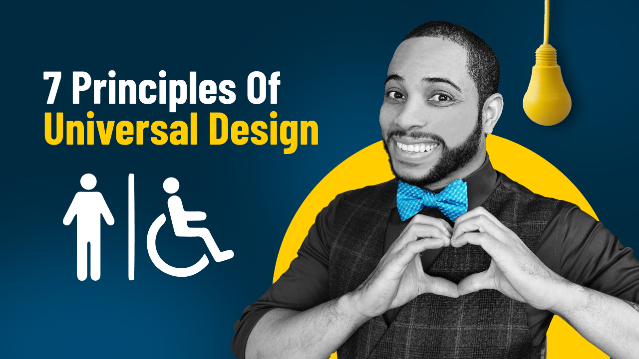
Making the web an equal playing field
Equal access to the web is something you can accomplish by simply keeping things in mind as you go, including features you might overlook. Doing this helps people with all kinds of abilities. Also, it is essential to understand that these things should be the default, not a bonus!
Of course, it is understandable that it can be hard to pinpoint what every user will need. But still, it’s much easier if you can anticipate some basic features you can include to help bridge those gaps along the way.
Implementing these features aims to give users the ability to control the sensitivity of the interfaces they interact with – or be compatible with the particular software for accessibility they use. Therefore making navigation possible.
1. Keyboard Compatibility
Have you ever tried navigating a website without your mouse? Unfortunately, some people have to do this every day, from people who lack the motor skills to control a standard mouse to people who don’t instinctively use it. However, you can tackle these concerns. All you need to do is make sure your website can operate using the primary navigation keys.
If you’re a gamer, you might appreciate being able to use the controller to navigate up and down and side to side. People navigating with a keyboard will use these arrows and other keys to navigate the site successfully.
Several people can’t use a mouse – for example, people with tremors or damage that causes reduced mobility or control of the hand. Therefore, your user experience will benefit significantly just by having keyboard navigation as an accessibility feature. Otherwise, people might click out of your website cause they can’t use it – keyboard compatibility is a feature that can take you a long way!
2. Contrast and Color Accessibility
If you’ve ever designed any webpage, you probably already understand the importance of color accessibility or contrast. If you haven’t, that’s okay – chances are, you’ve seen it plenty of times in use. People gravitate naturally towards clear and easy-to-read web pages – after all, you don’t want to read grey text on a black background, do you? How about pink text with a red background?
Finding that perfect balance will not only make your website look better and retain readers for an extended period. In addition, you’ll find that more readers will find your text easy to read, like people with macular degeneration or those with low contrast sensitivity.
Carefully considering the color contrast you use will make your interfaces easier to see in poorly lit or over-lit conditions. As a result, people will generally struggle less to read what you have to say or experience less screen fatigue.
Pro tip: You don’t want the contrast to be so low that people can’t read anything and get their eyes strained or exhausted. But you probably don’t want to make it so bright that it hurts and causes people to go blind. So, try to keep it goldilocks friendly. Not too bright, not too dark, just right!
3. Understandable Content
Have you ever gone to read an article and felt like it was going right over your head? That’s because they didn’t make their content accessible – something so many people forget to do. By creating easy-to-comprehend and accessible content, you’re ensuring that everyone who visits your site can read and take in the content you’re offering.
The best understandable content uses simple language and keeps the writing concise and readable for all users, no matter the level of education or cognitive abilities. Delivering your content in straightforward language makes the concepts simpler. Also, people with mental disabilities like dyslexia or ADHD will thank you – and you’ll probably catch their attention a lot easier too!
Re-assessing where you stand is a healthy way to understand better how accessible your content is. So if you’re wondering if your content is understandable – ask yourself the following questions.
Does your content include headings, subtitles, or summaries? Do you provide captions or alternative text for your images? More importantly, do you provide images, or other visual cues, to help your readers take in the information?
In summary, lower literacy or learning disabilities can prevent many people from accessing helpful information because it’s hard to digest. Shorter, more straightforward sentences and paragraphs, as well as simpler words, are all ways you can simplify your content without losing anything of value!
4. Large Buttons, Links, and Controls
Every good interface will incorporate buttons of some kind, but have you ever struggled to find the “click spot” on one and been stuck? Many ‘attractive designs’ will sacrifice function in place of aesthetic – which can turn away so many users.
Making your buttons smaller might look nice at first glance, but having easy-to-click links, buttons, and navigation makes for an all-around effortless user experience.
The thing is: small buttons, links, and controls (like checkboxes) can be extremely difficult for people to use, especially when these elements are close together or difficult to discern. This usability issue worsens when considering the numerous devices people use to access your sites, such as mobile phones and tablets. With decreased functionality and smaller screens, it’s much easier to mix buttons up or find them exceedingly difficult to use.
Large Buttons, links, and controls in a website’s design can help address the needs of almost any user – but especially those with reduced dexterity or those struggling to use a small screen. For example, people with arthritis or tremors in their hands and even people with temporary injuries.
With new design trends coming and going, it can be hard to use large elements and controls in your designs. But, believe it or not, using larger, easier-to-access buttons can be worked into an attractive design, making it more user-friendly without sacrificing the look and feel.
5. Customizable Text
Text on a website should never be ‘one size fits all’; in fact, some people struggle with consuming text-based information on websites very often. So when your users get stuck with words, you need to find a way to let everyone across the broad spectrum understand them and view them. That’s where the customizable text comes in!
By giving your users the ability to control and adjust their text, you’re making it easier to view and consume your content. In addition, using this feature benefits everyone, not just people with disabilities.
Many users suffer when the text is too tiny and has small margins. In particular, this makes web pages a nightmare for people with low vision, dyslexia, or other cognitive disabilities that affect how they interpret a text. The ability to customize will make a huge difference in their browsing ability and keep people around much, much longer on your site.
Using fluid typography in your designs can be a helpful way to address these issues. Fluid typography is the practice of designing websites with dynamically sized text and headers that will grow or shrink to fit different screen sizes. That way, you can switch between devices, like your mobile phone, desktop, or tablet.
I know this might sound like a lot of work. But you don’t have to implement all of these features in one shot. Instead, tackle it one feature at a time, so it doesn’t feel overwhelming, and you can collect feedback from your users as you go.
Using these features in your website projects will give you significant returns on the investment. Don’t think about it as just making accommodations for people with disabilities, but more improving your overall website experience and allow yourself the benefit of increased users. Considering accessibility needs is an essential part of expanding your reach and allowing more people to benefit from the content you’ve created.
Did you find this information helpful? Which feature would you like to implement on your website soon? Please let me know your thoughts in the comments below. Also, please give this article a thumbs up to support more content like this.
If you want more information on web accessibility, make sure you check out my YouTube channel. Also, make sure you subscribe to our newsletter for notifications about new content, so you don’t miss a single article!
[elfsight_social_share_buttons id="1"]